-
KolaxopackagingUSA
-
October 01, 2026
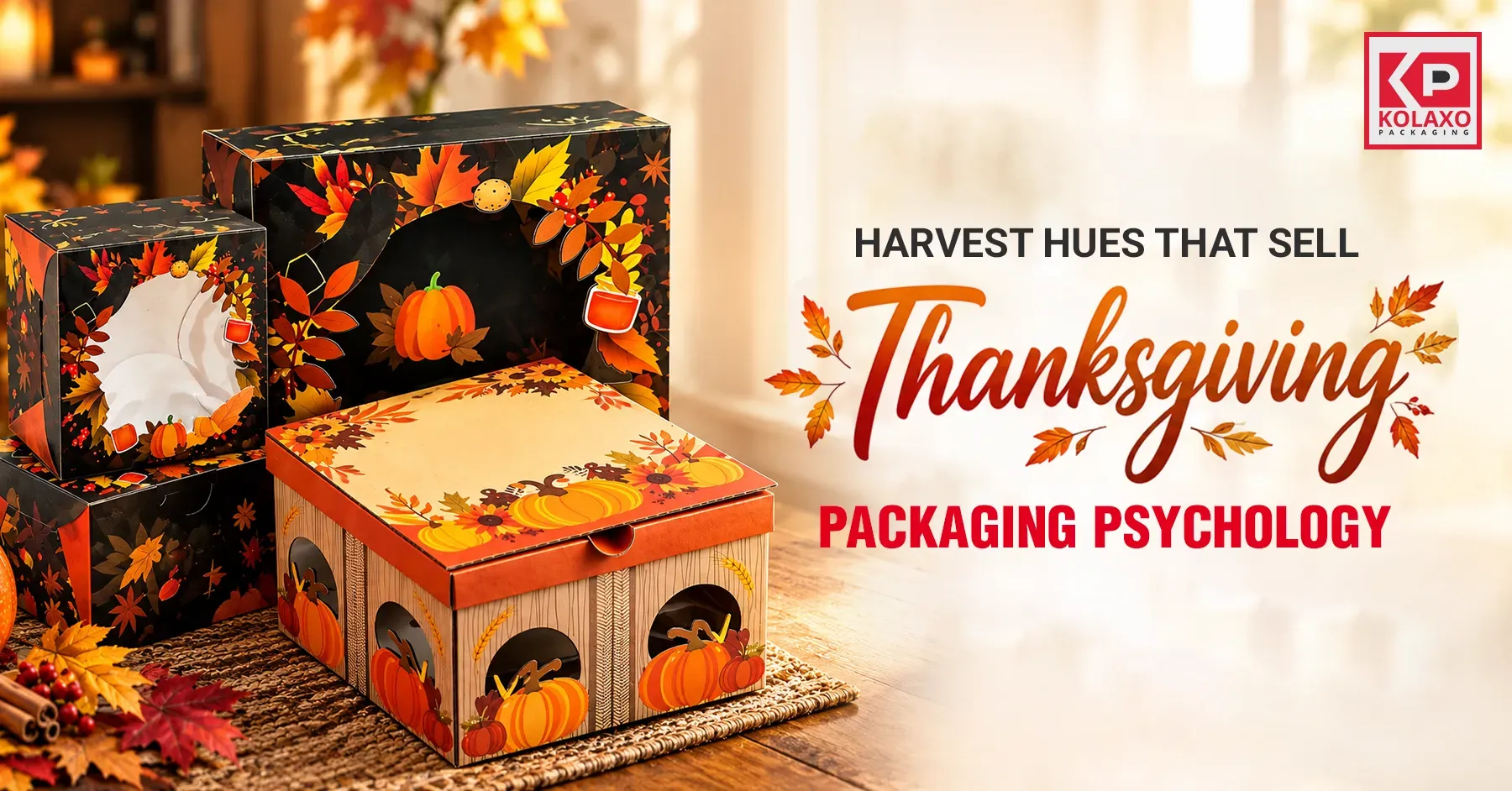
Harvest Hues That Sell: Thanksgiving Packaging Psychology
Have you ever thought about how some products make you stop and pick them up instantly? A lot of the factors depend on how you place the color strategically on the product’s packaging. Some shades attract customers to the product even before they use or taste it.
Color psychology matters because it helps your product stand out on the shelf. Especially if you are a business owner, then small shade differences can help you become more distinctive, especially for selling festive gift boxes at events such as Thanksgiving.
Burnt orange, metallics, and espresso brown all help create a different impact on the audience’s mind. In this blog, we'll share how Thanksgiving packaging psychology can help you capture customers' hearts and make your products shine during this special event. Let's begin!
How Can a Color Palette Make Your Brand Discoverable On Thanksgiving?
Thanksgiving is a family gathering, and the event is anticipated months before the arrival. Customers are all ready to buy gift boxes on Thanksgiving and are looking for stuff that seems reliable and fits the theme. Let's give you some quick data updates: Did you know that the National Retail Federation (NRF) recorded 202.9 million consumer shoppers between Thanksgiving and Cyber Monday in the year 2025, as compared to 197 million in 2024?
As brands already know that millions of people are ready to shop at this event, it poses a valuable opportunity for brand owners to capture customers' attention through festive packaging, and the best strategy is to use bold harvest colors that reflect the theme without hiding your brand’s identity.
Thanksgiving Packaging Color’s Psychology
As color plays quite an important role in brand recognition and identity, it also needs to be consistent, relevant, and in accordance with the theme of the festival. It should be smoothly incorporated across the design and logo.
We have created a list of elements that should be considered before selecting a color palette.
1. Brand Identity
As colors are responsible for evoking different emotions, you should choose the color according to your brand’s values. For instance, metallic or espresso brown might look perfect if you are selling luxury Thanksgiving items.
Different age groups and demographics may have different associations with colors. Market research can help when selecting your color palette to find out the preferences and perceptions of your customers. Focus groups or surveys can provide feedback on different color palettes and their impact, helping you to keep up to date on these preferences.
2. Target Customers
Different ages and regions have different associations with colors. In this case, market research can help you select the color palette according to the place where you want to sell your product. Similarly, surveys or research reports might also help you draw out what your audience might be looking for. This will help you get the perfect custom Thanksgiving boxes in advance.
3. Psychology of the Brand
Along with understanding all the hues of Thanksgiving packaging, you need to also understand brand psychology and the category of your product and how to sell it.
You have to understand what Thanksgiving message you want to give to your audience through your product and effortlessly include it on your packaging box.
3 Case Studies
Let us give you 3 renowned case studies of popular brands that you can take inspiration from to maximize your seasonal sales.
1. Hershey's Thanksgiving Color Palette
You probably already know about Hershey's, as their chocolates are world-famous, but did you know that every year during fall, the famous chocolate brand turns its color palette to rustic golds, burnt oranges, and deep browns? This type of packaging reflects a nostalgic, rich, and warm vibe perfect for a Thanksgiving event, but their best strategy is to keep their brand identity alive by keeping the essence of Hershey's alive. If you are a confectionary/sweets brand owner then make sure to use this strategy for your custom chocolate or candy boxes!
2. Fall in a Basket by Traders Joe
Traders Joe takes the autumn season seriously and never misses the chance to celebrate it. If you would ever walk into one of their stores in November, then you will see a whole palette of home colors, such as warm browns, caramels, and a hash of brown. The store gives you Thanksgiving vibes, starting from chalkboard signs to shelf displays.
Their seasonal best sellers are also dressed in joyful and rustic designs such as maple butter and pumpkin brioche. Traders Joe never just sells food during Thanksgiving; instead, they sell the festive feeling in every shopping bag. if you sell bakery items or small delicacies, you ca also add some warm colors to your bakery boxes and attract new customers.
3. Google’s Thanksgiving Logo Doodle
Last year's ‘Google 2025 Thanksgiving doodle’ featured a tiny chef, a character loved by everyone because of its cuteness and culinary skills. The character was named Cheffy, preparing the Thanksgiving meal for everyone.
Google used its imagination beyond the usual harvest images and showcased the sentiments behind Thanksgiving season, such as sharing themes with your loved ones. And the newest part is that Google enhanced this experience with AI-driven help that suggested its audience with Thanksgiving decor, recipes, and what to do with the leftover ideas! Sounds interesting, right?
Major Thanksgiving Colors and Their Psychological Meaning
1. Espresso Brown
These come under the category of earthy tones and represent simplicity and stability and give a natural vibe. Brown-shaded packaging paired with a little kraft texture can help create an artisanal, rustic look that will go great if your brand prepares gourmet treats, baked items, or any handmade products. This color will look perfect with Thanksgiving gift boxes.
2. Burnt Orange
It evokes a warm and friendly energy that makes it quite a natural choice for Thanksgiving boxes. This shade also reflects the autumn season and goes well with pumpkin harvest, falling leaves, and family get-together illustrations. This color creates a nostalgic, welcoming touch to the packaging boxes.
3. Metallics and Gold Foil
These shades provoke a sense of elegance and luxury and go well with festive occasions. You can apply metallic or gold foils to borders, typography, or logos for celebrating the season of Thanksgiving gift boxes. This will create a premium look without compromising on your brand identity.
A small design tip: Instead of choosing all Thanksgiving colors, choose one or two colors that would go well with your brand identity.
Wrap Up
While many brands have no idea about Thanksgiving packaging color psychology, your brand can have a competitive edge over others with our guidelines.
Before selecting a color for your custom packaging, it is essential to know the demographics and target audience that you are going to sell your products to. And finally, to grab attention that stays long-term and develops loyalty, you need to play with the right colors without neglecting your brand identity.
With this, our blog comes to an end. We hope your festive gift boxes sell fast and you get the perfect hang of the colors through our guide. Looking for unique custom Thanksgiving boxes? Contact Kolaxo Packaging USA right away, as we provide 24/7 service to our customers!
Wishing you a warm Thanksgiving season!


